
As I wrote earlier, this graphic novel has many of my favorite inspirational and artistic elements, such as, the Angel of Bethesda, the New York City subway, scientists and artists, Italian culture etc. But, just like every creative project, there are obstacles I needed to overcome and creative problems I needed to resolve. There are 2 major challenges I faced. First, creating an atmosphere from the place and time I have never been to can make it look fake and can have factual errors. Second, 3 intertwined timelines may impose a lot of unwanted ambiguity on the visuals and may confuse the readers.

My protagonist walks around 1982’s and 1989’s New York City. To make this believable, I researched how the city was back then. From New York Public Library, I found some archived images on Bethesda Terrace back in 1980’s. A visit to the New York Transit Museum informed me that back in 1980’s, people used the bronze transit coins as the MetroCard that we use now only started from 1995. This was a crucial piece of information as I imagined a close-up of my protagonist using these coins to enter the subway. Another major element of 1980’s subway was the graffiti. My own essay and research on graffiti at the Art Institute from 2013 came handy in this regard. Together, such detailed research gave me enough visual elements to create the 1980’s New York City.
The challenge of 3 intertwined timelines was my favorite. I deliberately wanted to make them visually and stylistically distinct. For the story line, 1989 is the current time and a very emotional time for my protagonist. So, I chose free-form panels and abstract paintings in the background to depict this emotional atmosphere. On the contrary, I followed the structured panels and somewhat dated colors and style, as found in Franco-Belgian comics like Tintin and Asterix, to draw the scenes from 1980’s New York City.
But, the third timeline is the trickiest because of 2 reasons: first, it takes place in 1983’s Northern Italy (where I have never been to) and, second, the film Call me by your name by Luca Guadagnino that inspired me to make this graphic novel was highly immersive (so I didn’t want to compete with that level of color, sound and texture). The solution to this problem came in a very unusual way.
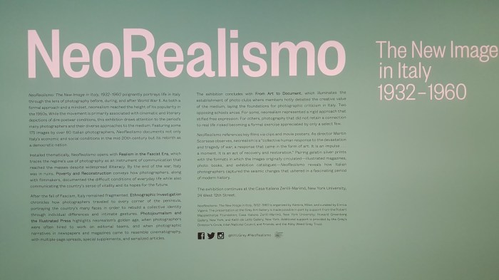 Back in October, when I was visiting New York City to look for apartments, my auntie, Cynthia took me to see an exhibit at the Grey Gallery of New York University. It was called NeoRealismo and luckily it showed photographs from 1960’s Italy. Most of the images were black and white with high contrast. From here, I got the idea of using black and white images so that I leave the choice of colors to the readers’ imagination. For the style, I chose completely analog technique – charcoal on paper. This immediately created a sharp contrast with my otherwise semi-digital styles of the scenes in 1980’s New York City.
Although, so far, I only created 5 pages of this novel, all 5 of them were pivotal scenes and they standardized my visual choices which will be applied to the rest of the novel. I’m sure there will be new challenges as I work my way through this big project. But, I’m sure the fire in my heart will show me the way to solutions that the readers will appreciate.
What a beautiful way to begin a new year! Peace and Love!
