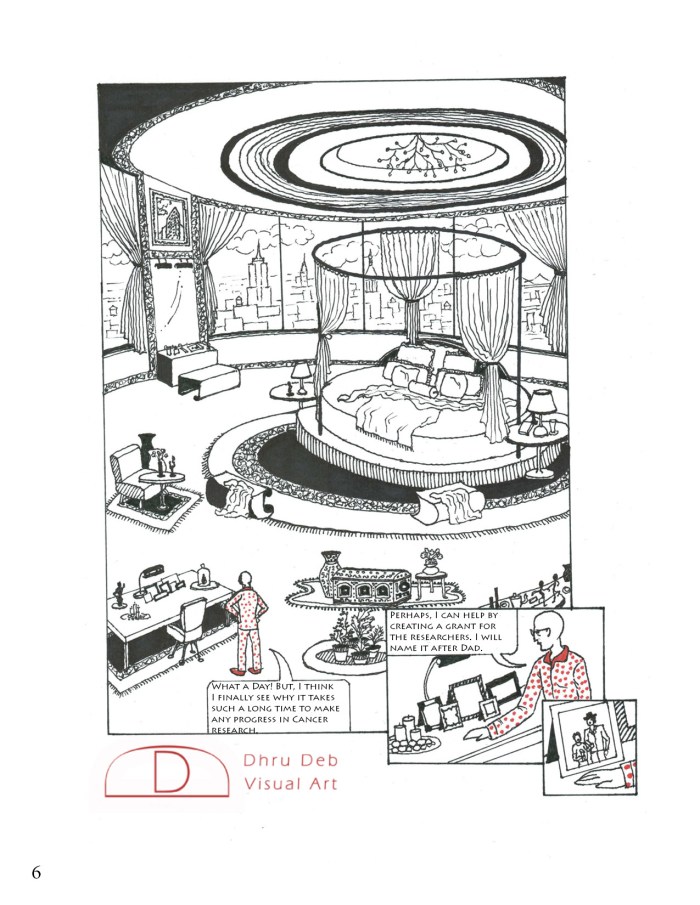
As a response to the dryness and overuse of infographics in cancer research, I’m turning boring numbers and basic shapes into characters and metaphors and making complex science available to lay audience (inspired by the work of Drs. Benjamin Bach and Matteo Farinella in science communication via art, illustration style of Julia Wertz and of course New York City!).

You can read the peer reviewed scientific research papers, that were discussed in the comic, here and here.

It’s really awesome.
Cancer is a vast topic and it can be explained in such a simplest manner is just praiseworthy. You are an epitome of talent and intelligence.
Well done Dr. Dhru!!
LikeLike